Wealth and Financial Capital
Last week I introduced my view that the various interlocking components of the industrial system are beginning to break down. The first one I mentioned was that “financial markets have been allocating capital into vast asset bubbles instead of into productive investments.” To dig deeper into this claim a good starting point is to look at wealth. The following chart shows the growth of private wealth in the United States, where private wealth is the sum of household and nonprofit organizations. The difference between the asset line and the networth line are liabilities.

The amounts are in constant 2013 billions, using the CPI to adjust for inflation. The source data for the chart is published by the Federal Reserve (thanks to Dina Lamdany for compiling it).
Several features stand out. First, private wealth has grown more than 8x during that time period (for comparison, US population grew roughly 2.3x over the same time from 140 to about 319 million). Second, growth in private wealth accelerated significantly around 1995. For the fifty year period from 1945 to 1995 the compound annual growth rate was about 3%. From 1995 to 2006 it accelerated to 5%. Third, the crash of the financial markets in 2008 stands out clearly. Equally clearly though private wealth has now exceeded the pre 2008 levels and has grown extraordinarily from 2012 to 2013, expanding by 12%.
One of the to dos here is to try to bring this data all the way back to the 1780s. Why? Well, at the time of the drafting of the US constitution there were fewer than 4 million Americans. The population has grown nearly a hundredfold since then. It would be interesting to know by how much wealth has changed over the same time period.
Thanks to research done by Emmanuel Saez and Gabriel Zucman we know in increasing detail how unequally distributed the growth in wealth has been in recent years. They recently published the following chart showing the percentage of wealth held by the top 0.1% of the population in the US (which requires greater than $20 million in networth)
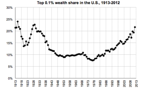
So at the same time that wealth has grown significantly overall, the share of it held by the very rich has increased substantially and is now back at levels last seen in the Roaring Twenties. Again, it would be interesting to see if one can come up with estimates for what this looked like even further back.
Here is how this translates into absolute numbers, focusing on the period of growth. In the mid 1970s the share bottomed out at about 7.5% of a total private wealth of about $22 trillion for a total of $1.6 trillion. By 2013 it had climbed to 22% of about $70 trillion for a total of 15.4 trillion (the reason I am saying “about” is that I don’t have the exact decomposition of private wealth into households versus nonprofits). That is almost a 10x increase and a staggering number overall.
I will come back to the implications of this growth in concentrated wealth in subsequent posts. But first I will start digging a bit deeper into the composition of wealth which is also intriguing.
Posted: 7th April 2014 – Comments
Tags:
wealth statistics
